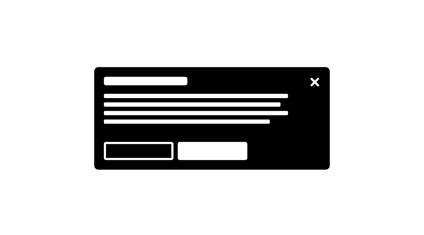
A well-designed modal ensures clarity, focus, and accessibility, helping users complete tasks efficiently while preventing unnecessary disruptions.

When to use
✅ Confirming critical actions
✅ Requesting user input
✅ Displaying important alerts
✅ Focusing user attention
When not to use
⛔️ For minor notifications
⛔️ As a primary navigation method
⛔️ When users need background context
Modal types & behavior
Different modal variations are used based on the type of interaction required:
Modal type | Behavior |
|---|---|
Standard modal | Used for basic confirmations or additional details. |
Full-screen modal | Expands to cover the entire viewport for complex forms or workflows. |
Side panel modal | Slides in from the side, allowing users to reference other content. |
Alert modal | Focuses on warnings or urgent system messages. |
Best practices for usability
Keep content focused – Modals should contain only essential information and actions.
Use clear call-to-action buttons – The primary action (e.g., “Confirm”) should stand out, while secondary actions (“Cancel”) should be more subtle.
Prevent background interaction – Users should not be able to interact with elements outside the modal.
Allow easy dismissal – Users should be able to close modals using:
The
Escape keyA
close buttonClicking outside the modal (for non-critical dialogs)
Accessibility considerations
Keyboard support – Users should navigate using the
Tab keyand close the modal withEscape.Focus management – When a modal opens, focus should move to the first interactive element inside.
ARIA attributes – Use
role="dialog"andaria-labelledbyfor screen reader support.
Continue reading
Looking to contribute?
Your input matters! Whether it’s feedback, design suggestions, or new ideas, every contribution helps shape a more refined, flexible, and efficient design system. Share your thoughts and be part of building something better for everyone.